Lockdown: a chance to tackle your website?
If, like many small businesses, you’ve had to slow down or close your doors while we navigate our way through the next few months, now could be the perfect time to give your website a little TLC.
It’s not something we get round to very often, but looking at your website from the perspective of a first-time visitor can be surprisingly insightful.
Years of tweaking content and adding sections can interrupt the flow of your messaging, so, why not take some time to find out what’s working well, and what can be improved?
But before I start, I’d like to make a small disclaimer:

Stressed mum working from home with toddler.
I know that for many small business owners, being in lockdown is NOT the best time to make grand plans for the future, take up a new hobby or learn new skills.
For most of us, it’s all about survival.
Juggling work commitments alongside childcare, homeschooling, cabin fever, isolation and endless Zoom meetings – while maintaining some semblance of normality – is quite enough to be getting on with, thank you.
BUT, if you do find yourself with time on your hands, here are five ways you could improve the content on your website, while we wait for normal service to resume.
First up, why does good content matter?
The most important question to keep in mind when you write content for your website is:
Who are you writing for?
Every reader is a potential customer, a returning customer, someone who’s looking for information or advice.
The best content grabs their attention, uses language that resonates with them, and solves their problems.
It takes them on an effortless journey from first click to taking action (whether that’s booking an appointment or buying your product or service).
A website shouldn’t be a vanity project – somewhere to just show off and brag about your business.
Because, quite frankly (brace yourself):
Your customers don’t really care about you.
They just want to find the information or product that they’re looking for, and be on their merry way.
So give it to them.
Don’t make them work too hard (because they simply won’t bother)
It might seem counter-intuitive, but looking after your customer first, answering their questions and enabling them to find information quickly, is the key to good SEO.
Google recognises useful websites and rewards them with a higher ranking.
If people come back to your site regularly, share your content or make the journey from landing page to checkout quickly and easily, you’ll soon see the pay off in ranking.
A higher ranking means more traffic.
And more traffic means and more sales.
So, look after your customers with good, interesting, useful content, and everyone’s a winner.
1. Write a killer headline
If the opening header on your homepage says ‘Welcome to my website’, ‘Hi, thanks for visiting’, or any other generic stream of nothing-words, it needs to change. Now.
This is the most important sentence on your whole site, for two reasons:
- It tells readers that they’ve come to the right place (and why they should stick around), and
- It helps Google (and other search engines) to understand what content is on that page, so it will rank better.

Man browsing the internet on his mobile phone.
What do people type into the search bar when they’re looking for your products or services? (Hint: it’s not ‘welcome to my website’).
Have a think about what your business’ USP is.
- What do most customers come to you for?
- What problems do you solve?
- Why are you better than your competitors?
You need to dig down and find out the most compelling thing about your business (from your customers’ perspective) and shout about it.
Within seconds, visitors need to understand:
- Who you are
- What you do – or more precisely, how you can help solve their problems
If it’s not immediately clear, they’ll simply click away.
You have around 2.5 seconds to seal the deal, so use a strong attention-grabbing headline, followed by a short paragraph summarising what you do. Give people a reason to read on.
Here are some good examples:
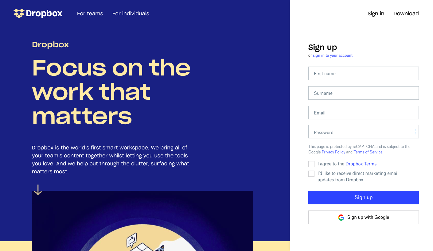
Dropbox: Focus on the work that matters.
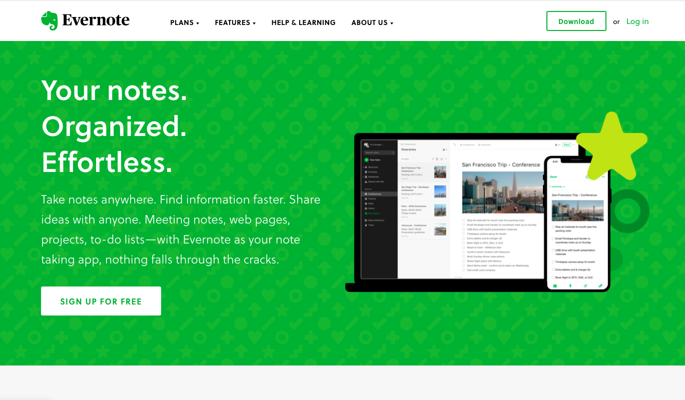
Evernote: Your notes. Organised. Effortless.
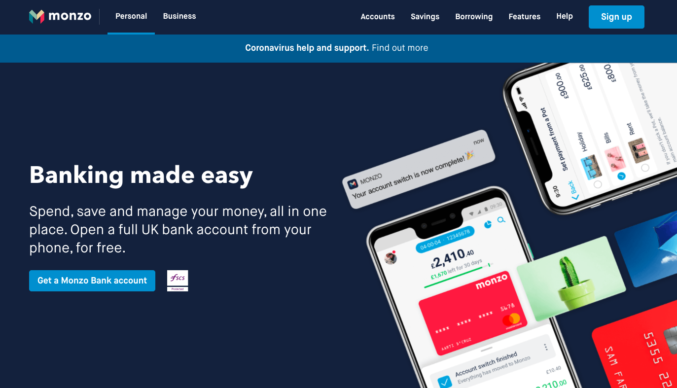
Monzo: Banking made easy.
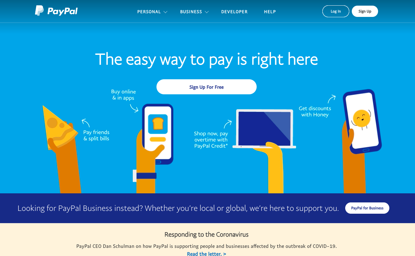
PayPal: The easy way to pay is right here.
Notice something else they have in common? A prominent call to action (CTA). Tell people who you are, what you can do to help, and a way to take you up on the offer.
2. Break up your content
Remember, people have come to your website looking for information, to buy a product or book a service.
They do NOT want to wade through reams of waffle, however well written it may be.
People only read about 20% of the content you write, so make it easy for them to get to the bit they’re interested in.
How? By breaking it up into manageable chunks.
- Use short paragraphs (maximum 3-4 lines)
- Add headings and sub-heads for easy navigation
- If a graph or image can explain your point more clearly, use them
- Make use of video – it can increase engagement and conversion
- Use bullet points or numbered lists, like this one
Content needs to be scannable, so people can quickly find what they’re looking for.
But don’t worry. Chances are, if you answer their question well and can lead them to other parts of your website for more information, they will stick around and read on.
3. Put your customer first
i.e. Don’t waffle on about yourself.
You’d be surprised how many businesses make this mistake – they’re so keen to get their message across and tell everyone how brilliant they are.
But, back up a bit there, eager beaver.
Remember why you’re writing all this content.
Who’s it for again?
Exactly. Someone who is looking for specific information, or a product or service to solve their problem.
– They’re looking for a reliable plumber who’ll come out in an emergency
– They want to know how to get red wine out of a white rug
– They’re wondering whether they should switch car insurance providers
– They thinking about hiring a graphic designer to create some flyers
It’s unlikely they’re looking for a detailed account of your company history (unless, of course you’re Apple).
So, how should you tackle such enquiries?
All the content on your website (not just your homepage) should talk directly to the reader – about their problems, and how you can solve them.
Do a quick tally of how many times you use the words ‘we/us/me’ on your homepage page, and then count how many times you use the word ‘you’.
If the word ‘you’ doesn’t appear three times for every ‘we/us/me’, you need to rephrase a few sentences.
Remember, people don’t really care about you or your business.
They only care what you can do for them.
4. Highlight your best products/services
If most of your customers come to your site looking for a particular product or service, don’t hide it away in a long list of options.
Remember, you’ve got just a few seconds to convince someone they’ve come to the right place.
So, if you know what your best-selling product is, or that most people come book an appointment online, make this the first thing they see when they click on your homepage.
You can worry about up-selling and cross-selling later. For now, you just want to give people what they want, so they don’t go elsewhere.
Having your most popular products/services on your homepage will help customers to make a decision about what to buy, too.
Your website’s job is to help people get from A (their question or problem) to B (your solution) as easily as possible.
If people have to search too hard, they’ll just click elsewhere.
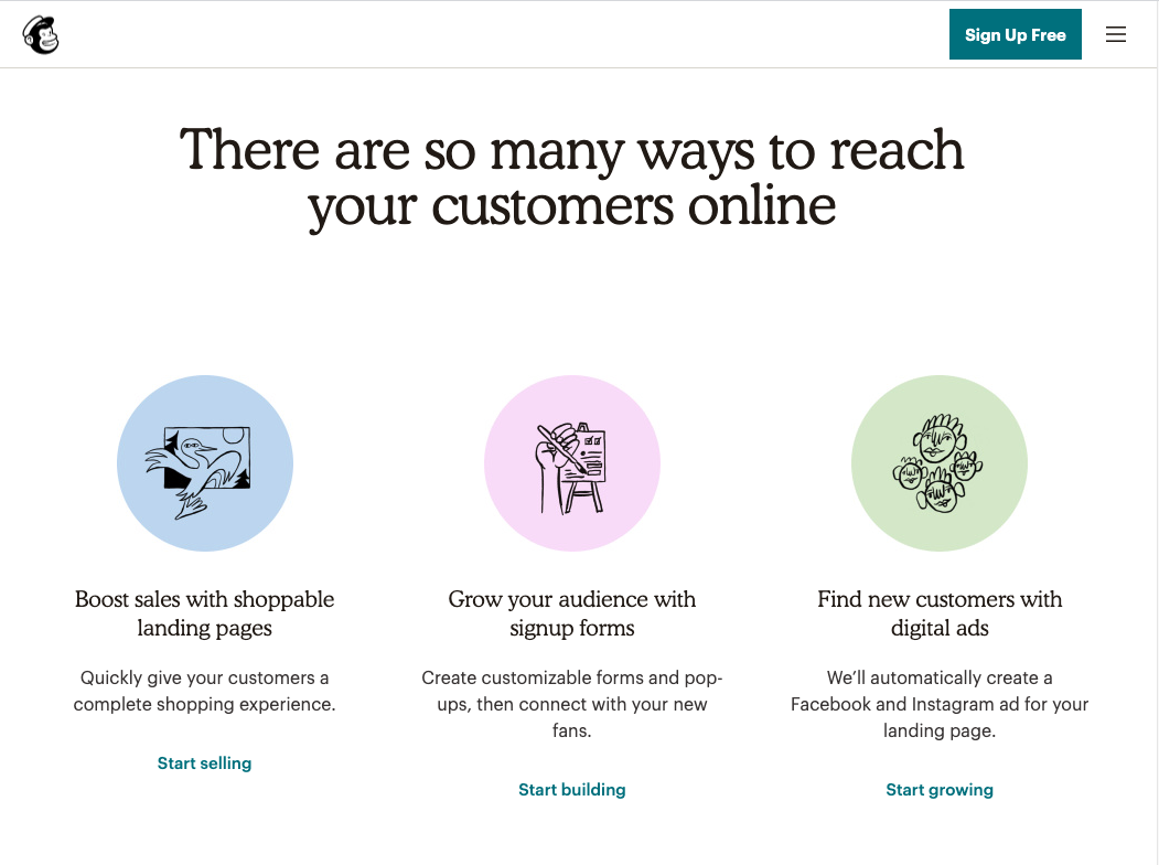
Mailchimp: Using clear language and clean design to show their main product offerings.
5. Make it easy for people to contact you
Some businesses deliberately hide their contact details, in a bid to stop people complaining, which is a really bad idea.
Not only will disgruntled customers take to social media to vent instead (and damage your brand), but listening to customers’ complaints and dealing with them effectively will actually boost your reputation.
It’ll also give you useful insight into what customers might be struggling with.
But, aside from this, a lot of people just come to your website so they can send you an email or call you to ask about opening times or product details.
It’s so easy to do, too. Just stick your email address or phone number in the navigation bar at the top, and you’re done.
That was easy, wasn’t it!